4 Ways to Shake Up Your Safety Signage
October 22nd, 2021 · Taye HardingEnsuring safety in a facility is of utmost importance, and safety signs play a crucial role in keeping everyone informed and protected. While safety signs need to convey important information clearly and effectively, they don't have to be boring or devoid of creativity. By adding a touch of creativity to your safety signs, you can make them more engaging and enhance their visual appeal. Here are some creative ways to promote safety while adding visual interest to your facility
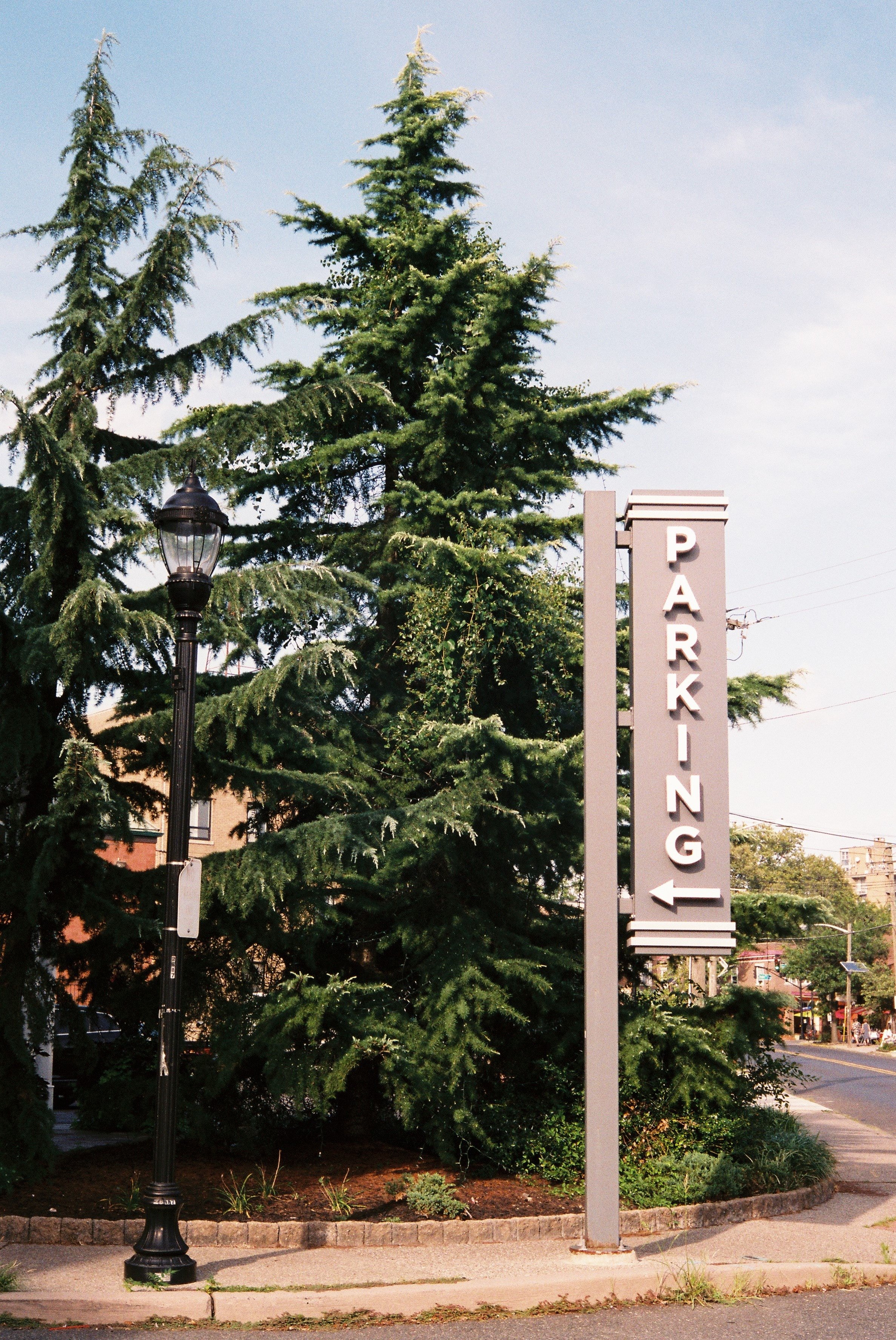
Parking Signs
Incorporating your brand look into designated parking areas can help create a cohesive and identifiable visual identity for your facility. Here are some ideas to incorporate your brand into parking-related signage:
Custom parking signs:
Design and install custom parking signs that feature your company logo, colors, and font styles. This will help visitors identify the parking areas associated with your facility and create a consistent brand experience.
Reserved parking spots:
Reserve special parking spots for specific purposes, such as "Employee of the Month" or "Customer Only." Use custom signs or graphics that highlight these reserved spots, incorporating your brand elements.
Color-coded parking zones:
If you have a larger parking area, consider designating different zones using specific colors and graphics. For example, you could use different colors for visitor parking, employee parking, and handicap parking. This can help visitors remember where they parked and navigate the parking area more easily.
Rule Signs
Communicating community rules and safety guidelines in a fun and enjoyable way can help engage and educate individuals while still effectively conveying important information. Here are some suggestions for incorporating color, graphics, and branding into your signage:
Use colors that align with your brand:
Instead of plain black and white signs, incorporate colors that are part of your brand identity. Choose colors that are visually appealing and complement the overall décor of your facility. This can help create a more vibrant and welcoming atmosphere.
Include relevant graphics:
Incorporate graphics or icons that are related to the specific rules or guidelines being communicated. For example, if you're emphasizing the importance of recycling, include a graphic of recycling symbols. These visuals can make the signs more visually appealing and aid in quickly conveying the message.
Design custom signage:
Create custom signs that reflect your branding elements, such as your logo, fonts, and overall style. This will help create a cohesive visual identity throughout your facility and make the signs more recognizable to visitors.
Use engaging language:
Instead of using dry and formal language, consider using friendly and approachable wording that aligns with your brand voice. This can make the signs more engaging and encourage people to pay attention to the message.
Incorporate humor or creativity:
Depending on the nature of your facility and the community rules being communicated, you may be able to inject some humor or creativity into the signage. This can help make the messages more memorable and enjoyable. However, ensure that the humor or creativity doesn't compromise the clarity and effectiveness of the safety guidelines.
Wayfinding Signs
Blending wayfinding with interior décor and branding can create a seamless and visually appealing navigation experience for visitors. Here are some suggestions to achieve this while ensuring clear instructions:
Clear identification of entrances and exits:
Use signage that clearly indicates the location of entrances and exits. This can be done through prominent signage at the entry points or by using directional arrows pointing towards the designated areas. Ensure that the it’s easily visible and placed at eye level for maximum effectiveness.
Digital signage for interactive navigation:
Consider implementing digital signage solutions that allow visitors to interact and find their destinations quickly and safely. Digital displays can provide dynamic wayfinding information, including maps, directions, and real-time updates. Visitors can engage with touch screens or interactive interfaces to select their desired destinations and receive step-by-step directions..
Consistent branding and design:
Ensure that the wayfinding signage aligns with your interior décor and branding elements. This can be achieved through the use of consistent colors, fonts, and graphic styles. By incorporating your brand identity into the signage, you create a cohesive visual experience that blends seamlessly with the overall ambiance of the space.
Clear and concise instructions:
While incorporating design elements, it's crucial to maintain clear and easy-to-decipher instructions. Use concise language and simple icons or symbols to guide visitors effectively. Avoid cluttering the signage with excessive information and focus on providing essential details to facilitate smooth navigation.
Unique Elements
There are numerous unique sign materials and applications available that can enhance the design and atmosphere of your location. Here are some examples:
Hanging wood signs:
Incorporating hanging wood signs can create a rustic or homey environment. Wood has a natural and warm aesthetic, and you can customize the design, shape, and finish of the signs to match your desired style.
Imaged glass:
Using imaged glass can provide a polished and modern finish to your signs. With imaged glass, high-resolution graphics, logos, or artwork can be displayed on the glass surface, creating an eye-catching and sophisticated visual impact.
Dimensional signage with backlit lighting:
Adding dimension to your signs can make them stand out. By using materials like acrylic, metal, or PVC, you can create three-dimensional signs with depth and visual interest. Backlit lighting can further enhance visibility, making the signs more noticeable, especially in low-light environments.
Specialty vinyl applications:
To update existing signs, applying specialty vinyl can give them the look and feel of more high-end materials. Specialty vinyl can mimic the appearance and texture of materials like brushed metal, carbon fiber, or wood grain, providing a premium aesthetic without the expense of using actual high-end materials.
